
Choosing Interior Colours For A West Coast Home
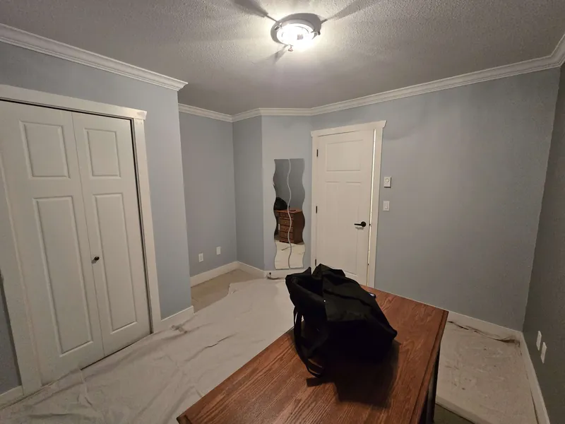
Picking interior colours is where most home projects stall. You bring home a stack of paint chips, tape a few to the wall, and a week later you are no closer to a decision. Out here on the West Coast it is even harder, because our light does something to those colours the showroom never warned you about. After years of painting homes across Metro Vancouver, here is how we help people land on a colour they love.
Our grey light cools everything down
The Lower Mainland gets a lot of soft, overcast, north-facing light. That kind of light is cool and blue by nature, and it pulls the warmth right out of a colour. A grey that looked cozy on the chip can turn flat and a little cold once it is on the wall in November. So we tell people to lean warmer than feels obvious. Whites and greiges with a touch of warmth in them read clean and inviting in our climate, while a crisp, blue-leaning white can look almost clinical on a grey day.
Learn to spot undertones
Every neutral has an undertone hiding underneath it, and that undertone is what you will actually live with. A "simple white" might lean yellow, pink, green, or blue once it is up. The trick is to compare colours side by side rather than judging one on its own. Hold your sample next to a true white card and the undertone jumps out. When in doubt in our light, warm and soft beats cool and stark.
Moody or bright? Let the room decide
There is a time for a deep, moody colour and a time for something bright and open. A good rule of thumb:
- Go bright in north-facing rooms and small spaces that already feel a bit dim. A warm off-white keeps them feeling open.
- Go moody in rooms with good natural light, or in a cozy den or powder room where a rich charcoal or deep green feels intentional.
Test big, and test at both ends of the day
This is the step people skip, and it is the one that saves you. Do not trust a tiny chip. Paint large samples, at least a couple of feet across, and put them on more than one wall in the room. Light hits each wall differently, so a colour can look great by the window and muddy in the corner. Then live with it. Look at it in flat morning light, in the afternoon, and under your lamps at night. A colour that holds up across all three is the one to trust.
Do not forget trim and ceilings
Walls get all the attention, but trim and ceilings carry a room. Keeping trim a clean, slightly warmer white gives the wall colour a crisp frame. For ceilings, a soft white usually wins, though painting the ceiling a shade of the wall colour can make a small or moody room feel wrapped and calm. Match your undertones across all three so the whole room feels like it belongs together.
Test hard, then commit
Here is the part that matters most. Once you have tested properly and a colour keeps looking right across the day, commit to it and stop second-guessing. Endless sampling is just anxiety in a paint can. The homeowners who love their results trusted what they saw and let the crew get to work.
If you are planning the full project, see how Primal scopes interior painting across the Lower Mainland before requesting an estimate.
Not sure where to start?
We do this every day, and we are happy to walk your rooms with you, talk undertones, and help you test the right samples before a single wall gets painted. Book a free, no-pressure colour consult and estimate, and we will help you get it right the first time.
Get My Free Estimate